GrapeData UX process
Clients commission GrapeData to run research tasks in niche markets around the world. GrapeData were struggling to meet the required target responses per task, which was hurting the business.
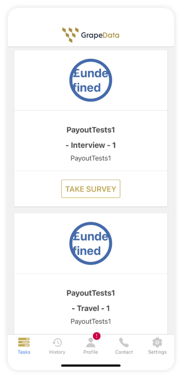
GrapeData meet targets when contributors respond to said tasks and provide quality data via the GrapeData app.
So why wasn’t there enough quality data coming through?
Key problems
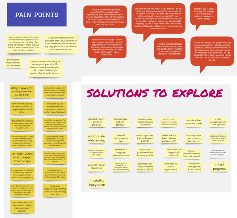
“Change user perception; users think that GrapeData is a scam. We need better reviews on Trust Pilot and App stores.”


User engagement
GrapeData were struggling to keep users engaged on the app. This was due to:
User retention
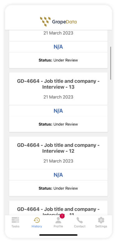
Contributors were dropping off the app within 1-3 months of signing up. This was due to:
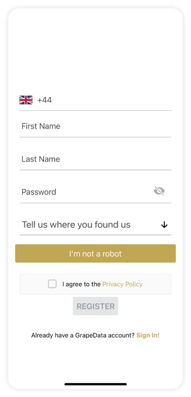
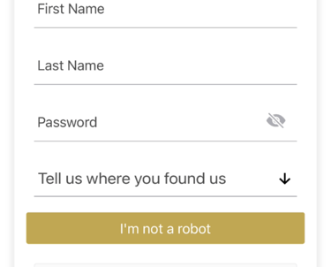
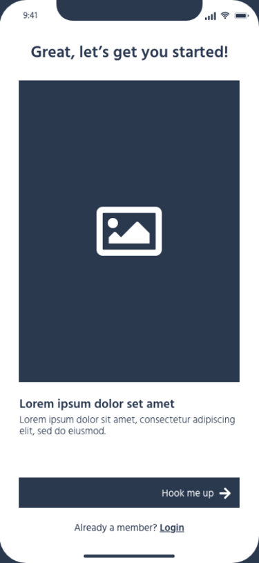
lack of a onboarding process
lack of transparency in the process
All leading the perception that GrapeData are a scam as they couldn’t deliver what was promised to contributors, which is cash in return for their expert knowledge.
poor user experience
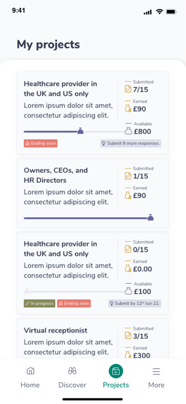
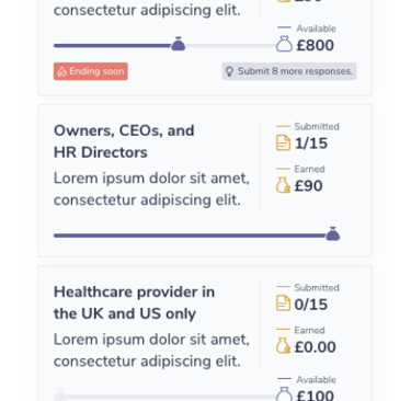
lack of tasks matched per user
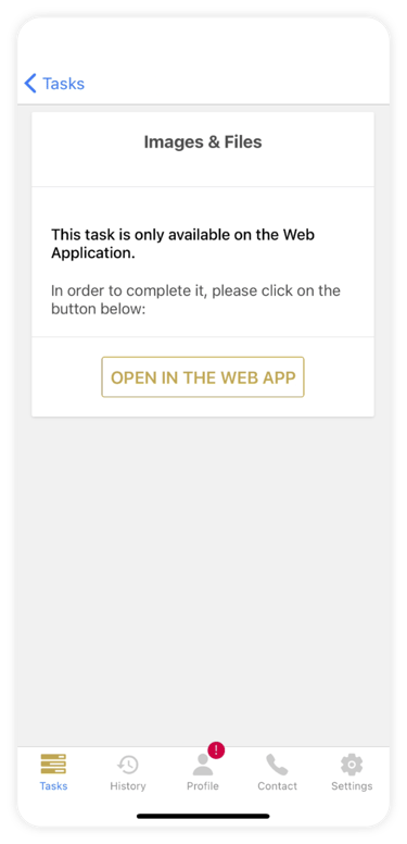
inability to submit successfully
As users could not successfully complete key user journeys, they’d become frustrated and drop off. This meant that the PMs would struggle to complete targets quickly.
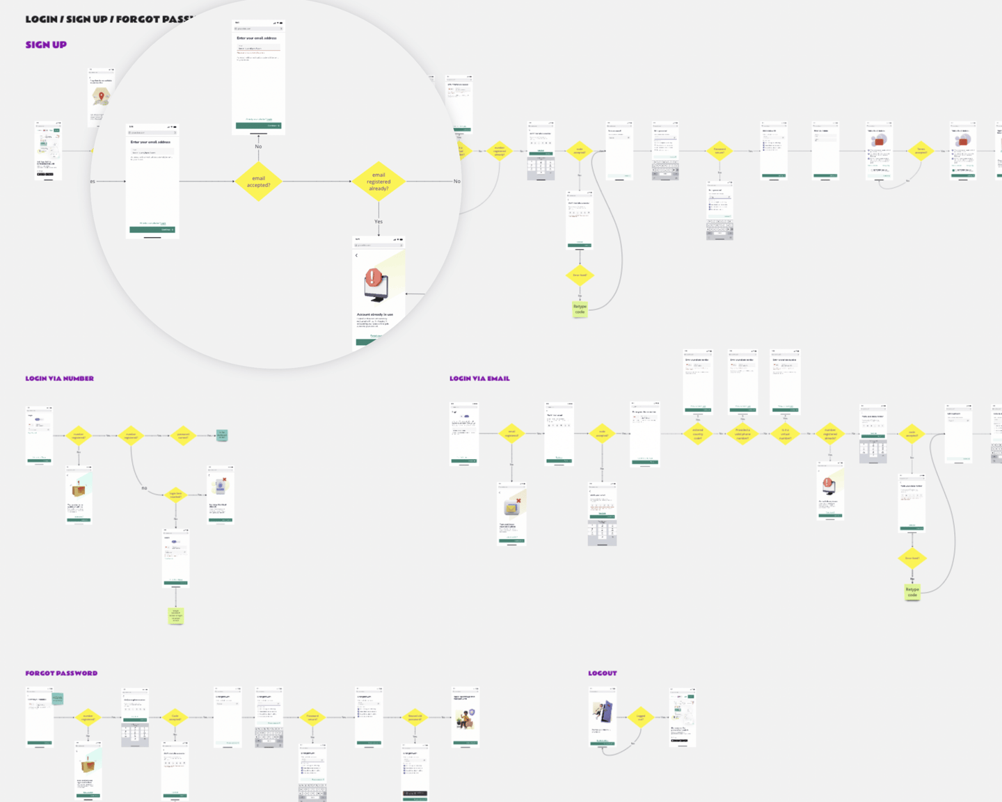
Previous app
Design process
Discovery
User input
Concept
Low-fi wireframes
Hi-fi wireframes
Visual design
Dog-fooding
Launch
Monitor
Testing

Iteration(s)
Discovery
user feedback forms from almost 1500 users
user feedback sessions with a smaller group
internal feedback of the app and user problems
self-tested the app
competitor research (Streetbees, Swagbucks etc)
industry best practices
Concept refinement
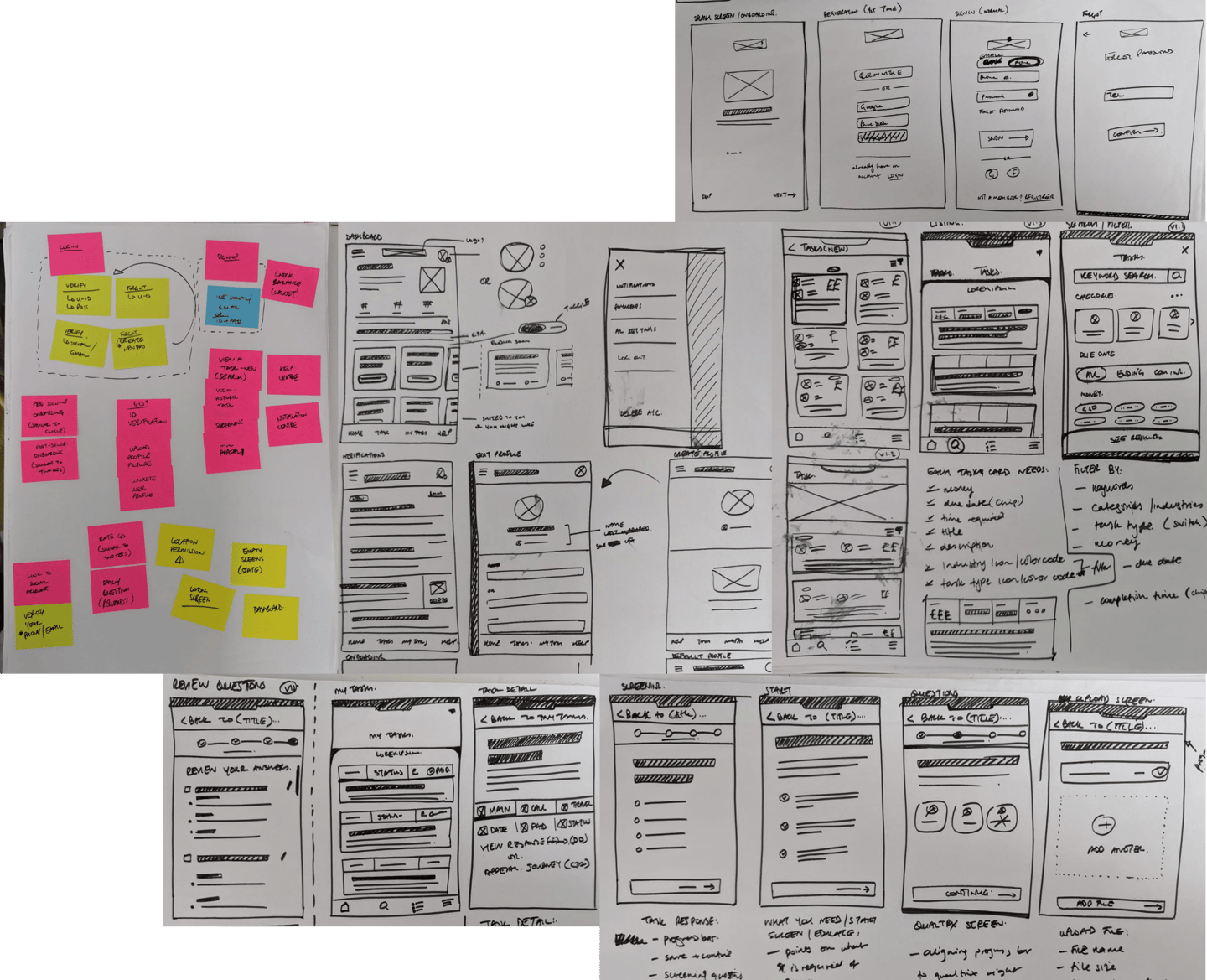
Hi-fi wireframes
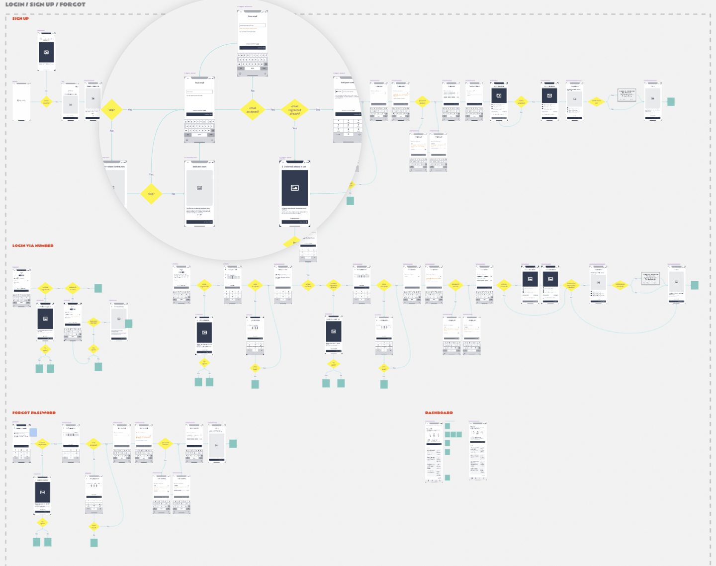
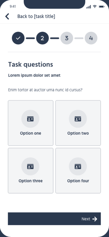
3 rounds of prototype testing held internally and externally at various iterations.
Visual designs
2 rounds of prototype testing held internally and externally at various iterations, along with Dog-fooding internally and externally before launch.
Some user testing insights
Users responded better to lighter backgrounds
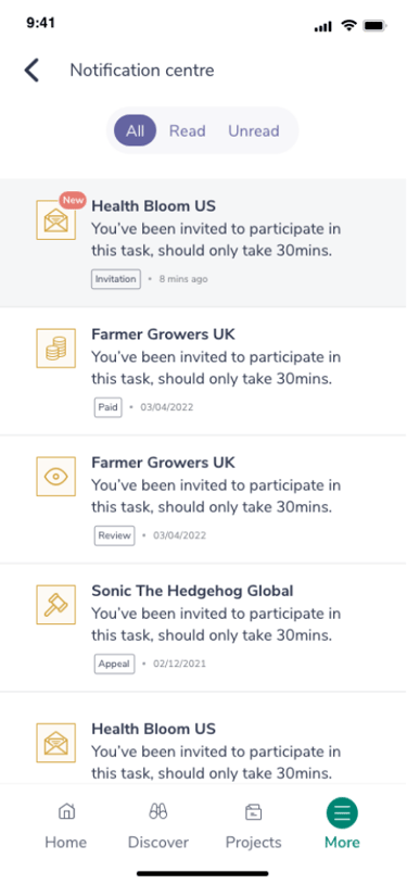
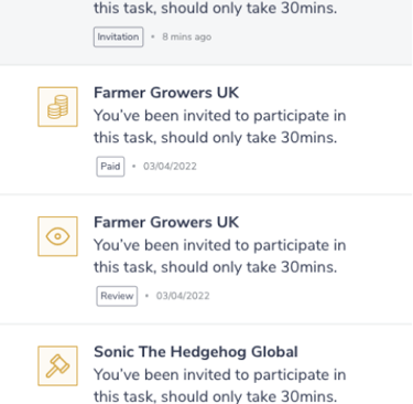
Some of the iconography wasn’t clear in “Discover”
Profile CTA on dashboard was not clear in wireframes
Our search and select component was not very intuitive
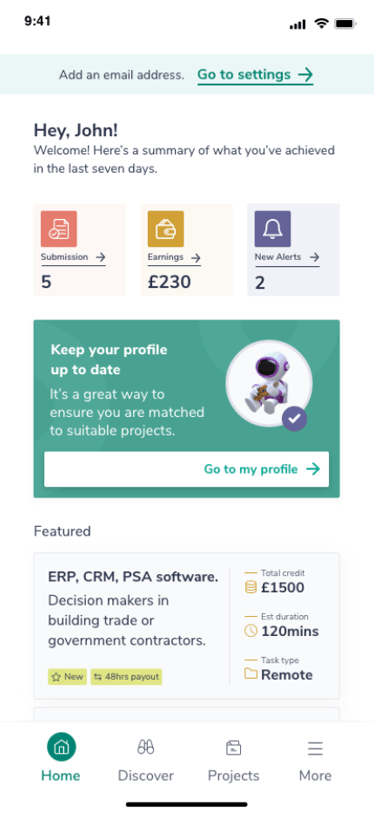
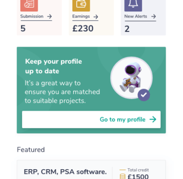
Users liked having key info on dashboard which easily takes them to relative sections
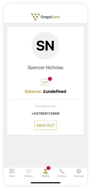
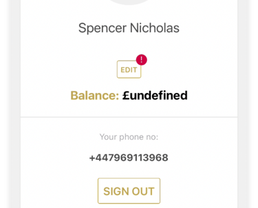
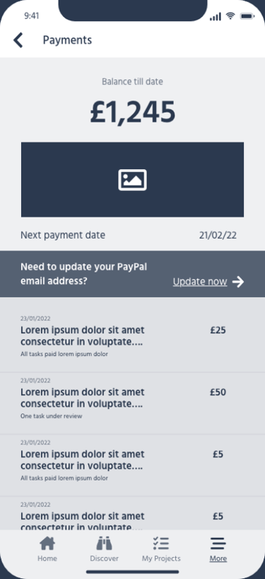
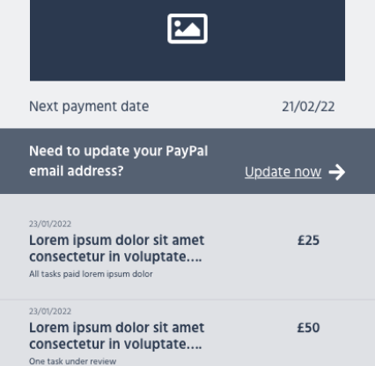
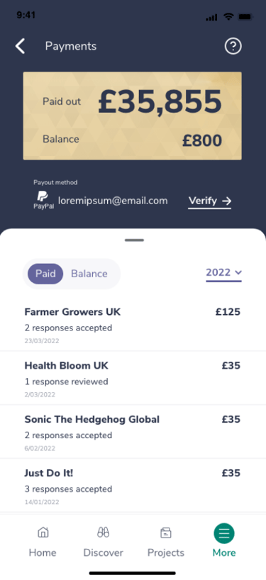
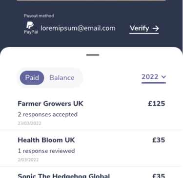
Users expected to see payment method on payments screen
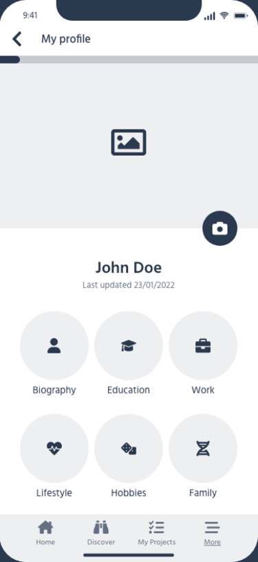
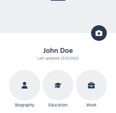
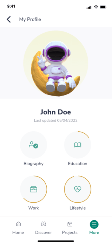
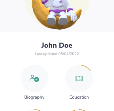
Users think the profile section is very important
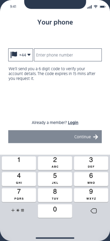
Users expected to go to Dashboard after signup
Participants expected fields to be active, rather than having to go into edit mode (profile)
Other insights
Payment schedule improved, allowing users to be able to rely on the income from GrapeData
Project managers took a more empathetic approach towards respondents, now that flaws within the app's process was apparent
Response times for support emails improved, ensuring reliability and trustworthiness
App branding designed to suit respondents rather than clients
Email templates and funnels created for important updates useful for respondents
That led to user-friendly changes across the business.
© Copyright Isra Tabassum 2026